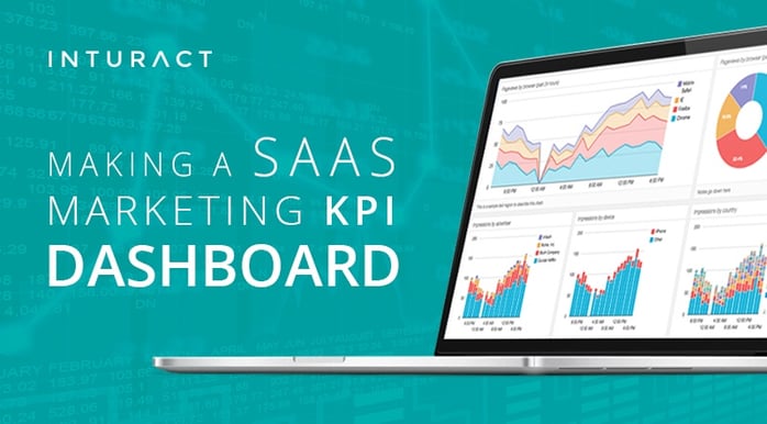
In the early stages of a SaaS company, the dashboard will more than likely contain all relevant data in one place. As the company grows, a division of the KPIs will be necessary as different individuals within your SaaS company require different data to be analyzed. Without dashboard separation, things will become muddled, confusing, and superfluous.
Let’s go over some best practices for deciding how to showcase your SaaS metrics by building a KPI dashboard.
Act 1 - Pre-design
Scene 1 - Who Is Your Audience
This will set the stage for your dashboard. If you are the CEO or founder, of a SaaS company, it is very likely you are creating the dashboard for yourself. This makes things a bit easier on you. If you are creating it for somebody else, you need to understand their position as well as what KPIs are relevant to them.
(Expert Tip: The best way to figure this out is by talking to the stakeholders and getting a clear picture of what they would like to see.)
Scene 2 - Measure Your Metric’s Worth
Knowing your audience will help you determine which KPIs (Key Performance Indicators) you need to supply them with. All KPIs are metrics, but not all metrics are KPIs. High-level KPIs are more suited towards an executive who wishes to quantifiably understand the trends in a company’s overall strategic objectives. Low-level KPIs will deal directly with internal teams, relating day-to-day information and performance. If both are required, it’s a good idea to separate them into different dashboards. The more concise and narrow a dashboard is, the easier it will be to read.
Scene 3 - Clutter May Cause Confusion
After deciding which KPIs to use, it is important to group your information. When you present the dashboard to yourself, or others, having an organized overview will make everyone happy. Not only will your dashboard be easy to decipher, but it will also prevent people from wishing to superficially harm you…
Intermission - Refreshing Refreshments
How often your SaaS marketing agency needs to refresh a specific KPI dashboard will depend on the needs. I realize that’s beating around the bush, but it’s true. Perhaps you require a report for weekly meetings, or even daily performance of a team. Scale the dashboard refreshment with the needs of your business.
You could also utilize an automated KPI dashboard, which will communicate and refresh live metrics throughout your business. We will talk more about these shortly!
Act 2 – Dashboard Creation
Scene 1 - Nothing Like The Presentation
Your metrics won’t all be presented the same, and indeed they shouldn’t. Many KPIs benefit from unique visualizations (arrows, bar graphs, line graphs, pie charts, etc.). This will help distinguish them, and should also make them easier to read.
The overall goal is being able to see what’s ‘working’ and what’s ‘not working’ in a glance. KPI dashboards are a form of communication, and the presentation is the language. It doesn’t matter how much you enjoy the company of Uncle Zed, if he doesn’t speak the same language it becomes difficult to communicate.
Scene 2 - Easy Does It
Your dashboard should focus on the metrics. Avoid using unnecessary graphics that distract from the information. You aren’t creating an eBook or even a smartly designed infographic (much to my dismay). Keep it simple; if you are wondering whether or not to include something, ask yourself this question: Does this [element] add to the readability of my dashboard?
Scene 3 - When to Use What
As stated earlier, how a KPI is visualized will determine what it’s tracking. Here is a list of ways to display your metrics:
i. Single Number + Secondary Value
Use this when you want to display a Main Value along with a Comparative Value. The Comparative Value will show the increase or decrease of the Main Value. Do not use this to display multiple values with various comparative values, things will clutter quickly, and you know what happens when things clutter.
ii. Pie Charts
Pie charts are best used to show parts of a whole. It should always equal 100%. Pie charts cannot be used to show change over time, and thus are not useful for real-time KPI reporting.
iii. Line Graphs
Line graphs are best used to compare change over time of various metrics. They are also useful in showing multiple relationships between KPI points. Do not use line graphs to show individual values.
iv. Bar Graphs
Bar graphs can be used to visualize data over time, either by itself or comparatively with other groups of data. Do not use bar graphs to compare metrics with no relationship.
v. Sparklines
Sparklines are basically line graphs without x and y values. They usually represent trends over a short period of time, and are commonly utilized to show stock market prices. Use Sparklines to show a succinct view of a single KPI. Do not use sparklines for detailed assessments.
vi. Bullet Graphs
Bullet graphs are a derivative of the bar graph. They can be used to measure multiple data points in a single chart. Bullet graphs are great for values but they do not show visual trends very well.
Scene 4 - High Roads and Low Roads
You have several options when deciding how to create your dashboard.
i. Create a Google/Excel Spreadsheet.
This process takes the most initial time, but they are free and easy to change. Although you are limited by your spreadsheet knowledge, thankfully Christoph Janz has create a KPI dashboard for early-stage SaaS Startups.
ii. Utilize a Real-time Dashboard.
This is far less time intensive, but does require money, and why wouldn’t it? Companies like SimpleKPI and Geckoboard capture your metrics in real-time and you can decide how they are presented. Your SaaS company will also need to use a data collection program to gather the data. The real-time KPI dashboard will then integrate with your data collection program and spit out the metrics into your dashboard.
iii. Creating a Combination of the Two.
ChartMogul allows you to upload a .CSV of your metrics (it is also a real-time dashboard). You can use this to populate your KPI dashboard. Be careful though, as you may have to do some major sheet reformatting if it does not meet mandatory specifications. Therefore, if you go this route, maybe with the intentions going real-time in the future, make sure to format your .CSV sheets appropriately.
Final Act
Final Scene - That’ll do Pig
If you are now brain dead, then my post has been successful. As you can see, there is a lot that goes into a KPI dashboard, and by no means was everything actually covered in this post. Once again, these are just some of my suggested guidelines on creating your dashboard. However, if you’d like to see a few high-level KPIs to utilize for your SaaS company, check out Samantha’s blog covering Which SaaS Metrics Matter Most.


